Essential Tips for Choosing Business Logo Wall Signs?
Choosing the right Business Logo Wall Sign can significantly impact your brand's visibility and recognition. These signs serve as a visual representation of your business, conveying essential information to potential customers. A well-designed logo sign can enhance your storefront and attract attention. However, the decision process can be daunting.
Consider factors like material, size, and placement. Each aspect contributes to the overall effectiveness of your logo wall sign. Not all materials may suit your environment or budget. For instance, metal or acrylic might look sleek but can be costly. Reflect on your brand's identity too. Does your logo resonate with your target audience?
Take your time to evaluate options. Don't rush into choices that might require adjustments later. A Business Logo Wall Sign is an investment in your brand's future. Ensure it aligns with your vision and values, making it both effective and memorable.
Understanding the Importance of Business Logo Wall Signs
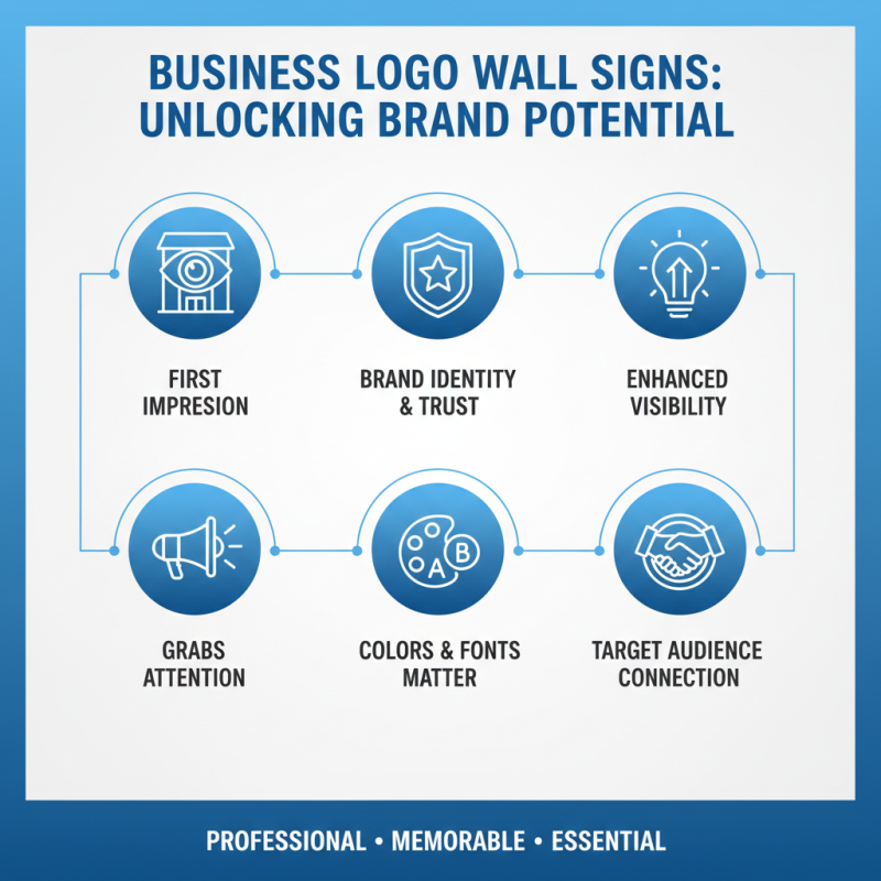
Business logo wall signs play a crucial role in brand identity. They are often the first impression customers have of a business. A well-designed sign grabs attention and conveys professionalism. It can enhance visibility, making it easier for customers to find you. The use of colors and fonts matters significantly. They should align with your brand’s message and target audience.
Creating a logo wall sign requires careful thought. The materials chosen should reflect the quality of your business. Wood, metal, or acrylic each offer unique aesthetics. You should also consider the location. A sign placed strategically can improve foot traffic. Customers tend to remember well-displayed signs. However, a poor design can lead to confusion.
Reflecting on your logo can reveal deeper insights. Does it truly represent your brand values? Is it memorable? Gathering feedback from your team can help. This process might expose unexpected flaws or strengths in your design. Failing to revisit your logo can hinder growth. Revising your business logo wall sign can keep your brand relevant over time.
Identifying Your Brand Identity for Effective Logo Design
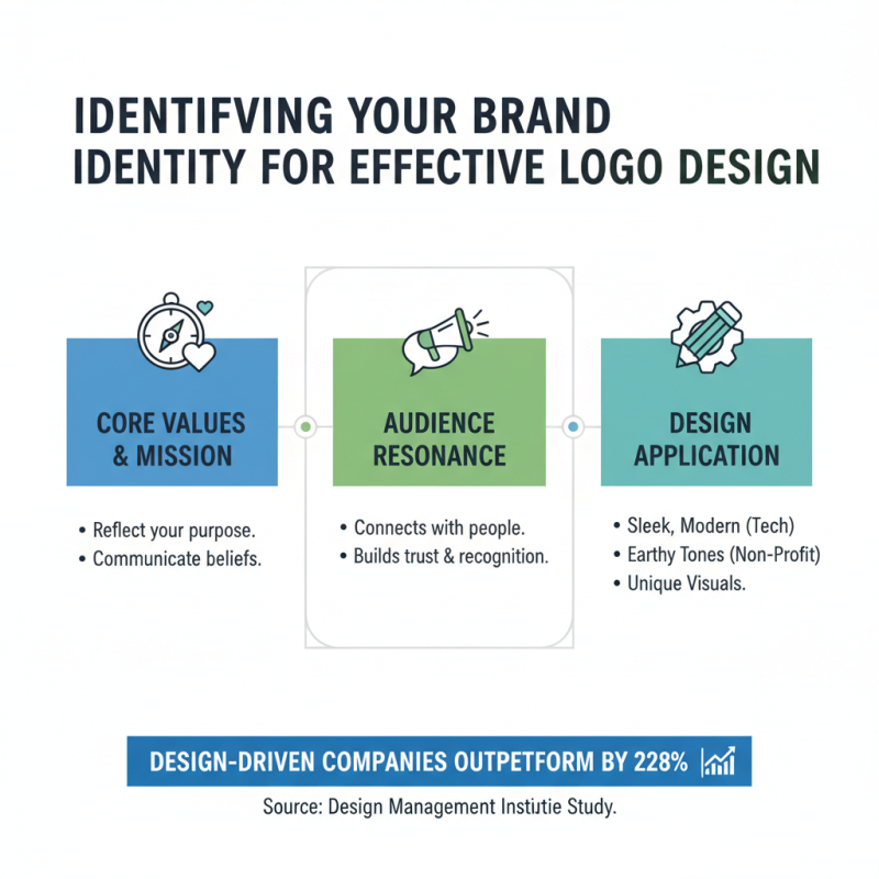
Identifying your brand identity is crucial for effective logo design. A study by the Design Management Institute found that design-driven companies outperform their competitors by 228%. This highlights the importance of a well-thought-out logo that resonates with your audience. Your logo should reflect your core values and mission. For instance, a tech company might choose a sleek, modern design, while a non-profit could opt for earthy tones to signify compassion.
Creating a successful logo involves understanding your target market. Conducting surveys or focus groups can help identify what appeals to your audience. According to recent reports, colors can increase brand recognition by up to 80%. Choosing the right color scheme is essential. Too often, businesses overlook this detail, leading to a disconnect between the logo and consumer perception.
Additionally, simplicity is key. A cluttered design can confuse potential customers. A study showed that logos with less than three colors tend to be remembered better. Reflecting on your logo periodically is vital. Market trends shift, and your logo must evolve. Evaluate its effectiveness annually to ensure it continues to align with your brand identity and audience expectations.
Determining the Best Materials for Durability and Aesthetics
Choosing the right materials for business logo wall signs is crucial. The choice impacts durability and aesthetics. Common materials include acrylic, metal, and wood. Each option brings its own set of advantages and challenges. Acrylic offers vibrant colors but may scratch easily. Metal signs provide longevity but can be heavy and challenging to install. Wood gives a warm, rustic feel, yet it may warp over time.
When considering aesthetics, the finish is vital. Matte finishes reduce glare but can show dirt easily. Glossy finishes are eye-catching, yet they may fade under sunlight. Reflective materials stand out but can be distracting. It's essential to balance visual appeal with practicality. Another consideration is the environmental impact. Sustainable materials may age better and resonate with eco-conscious customers.
Reflect on the purpose of your signage. If it’s meant to be temporary, lightweight materials might suffice. For a long-term investment, heavier, more durable materials are advisable. Revisit your choices after some time. Trends change, and what looks good today may not age well. It's a continuous journey to ensure your business sign aligns with your brand's vision.
Choosing the Right Size and Placement for Visibility
Choosing the right size and placement for your business logo wall signs is crucial for visibility. Studies show that nearly 76% of customers enter a brick-and-mortar store based on sign visibility. A properly sized sign ensures that your logo is recognizable from a distance. Typically, a letter height of 1 inch for every 10 feet of viewing distance is recommended. For example, if your sign will be viewed from 50 feet away, letters should be at least 5 inches tall.
Placement matters just as much as size. Position your logo where foot traffic is heaviest. 65% of customers notice signs when they are positioned at eye level. Ensure that your logo is not obstructed by other elements. A clear line of sight can significantly enhance brand recall.
Consider the distance from which your sign will be viewed. If it is too small or placed in a shadowy area, it might go unnoticed. On the other hand, oversized signs can appear overwhelming and distract from your message. Balance size with design for the best outcome. Regularly assess whether your signs are achieving their goals. Adjustments may be necessary as your business evolves or if you notice a drop in foot traffic.
Exploring Different Styles and Fonts for Your Logo Sign
Choosing the right style and font for your business logo wall sign is critical. Research indicates that 65% of people identify a brand by its logo alone. This statistic shows the importance of creating a memorable visual representation. Different styles convey various messages. A bold, modern font can evoke innovation, while a classic serif may suggest tradition and reliability.
Exploring font combinations can also enhance a logo’s impact. Pairing a sans-serif font with a decorative script can create contrast and interest. Yet, avoid over-complicating the design. A recent study revealed that designs using three or more fonts lead to brand confusion for 70% of consumers. Striking the right balance is vital for effective communication.
Color choice is equally significant. Colors are associated with emotions; blue conveys trust, while red can stimulate excitement. The wrong color can unintentionally undermine your brand’s message. Depth of color should also be considered. High contrast increases legibility from a distance, a critical factor for wall signs. In essence, an effective logo should reflect your brand’s identity while being visually engaging and easy to understand.
Business Logo Wall Signs - Style and Font Preferences



 Inquiry
 Email
Email WhatsApp